CSS模拟数字loading
实现方案
使用
css计数器展示进度数字使用CSS Houdini中的@property自定义css属性,并且可以在动画中修改该属性的值
CSS Houdini @proerty
@proerty可以让我们自定义一些CSS属性,然后在样式中使用,使用方法和display、font-size等这些相同
TIP
- 自定义属性的命名和CSS变量相似,要以
--开头,比如@property --aaa {}
CSS Houdini中的@property语法如下:
css
@property --property-name {
  syntax: "<color>";
  inherits: false;
  initial-value: #c0ffee;
}
syntax:指定该属性的语法,可以是
数字、颜色、角度、时间等,支持的属性点击@property/syntax查看inherits:指定该属性否默认继承
initial-value:指定该属性的默认值
倒计时demo
html代码
html
<!doctype html>
<html lang="en">
<head>
    <meta charset="UTF-8">
    <meta name="viewport"
          content="width=device-width, user-scalable=no, initial-scale=1.0, maximum-scale=1.0, minimum-scale=1.0">
    <meta http-equiv="X-UA-Compatible" content="ie=edge">
    <link rel="stylesheet" href="./index.css">
    <title>Title</title>
</head>
<body>
<div id="root">
    <div>
        <h1>小试@property</h1>
        剩余时间
        <span class="percentage-count"></span>
        <br>
        <button class="count-down">开始倒计时</button>
    </div>
    <hr>
</div>
<script>
    const countDownBtn = document.querySelector('.count-down');
    const percentageEl = document.querySelector('.percentage-count')
    countDownBtn.addEventListener('click', () => {
        percentageEl.classList.remove('active');
        percentageEl.offsetHeight; // 加这一行代码可以让倒计时结束后,再次点击按钮重新进行倒计时
        percentageEl.classList.add('active');
    });
</script>
</body>
</html>
css代码
css
@property --percentage {
    syntax: '<integer>';
    inherits: false;
    initial-value: 30;
}
.percentage-count {
}
.percentage-count::before {
    --percentage: 30;
    counter-reset: count-down var(--percentage);
    content: counter(count-down) 's ';
}
.percentage-count.active::before {
    --percentage: 0;
    transition: 30s --percentage linear;
}
如上代码,点击按钮后,可以看到倒计时从30s到0s,每秒减1
文字loading
loading效果先快后慢,速度可以到贝塞尔曲线工具网站获取想要的速度
html代码
html
<!doctype html>
<html lang="en">
<head>
    <meta charset="UTF-8">
    <meta name="viewport"
          content="width=device-width, user-scalable=no, initial-scale=1.0, maximum-scale=1.0, minimum-scale=1.0">
    <meta http-equiv="X-UA-Compatible" content="ie=edge">
    <link rel="stylesheet" href="./index.css">
    <title>Title</title>
</head>
<body>
<div class="root">
    <div class="loading-text">加载中...<span class="loading-number"></span></div>
    <div>
        <button class="btn-loading--start">开始loading</button>
    </div>
</div>
<script>
    const startLoadingBtn = document.querySelector('.btn-loading--start')
    const loadingNumberEl = document.querySelector('.loading-number')
    startLoadingBtn.addEventListener('click', () => {
        loadingNumberEl.classList.remove('finished')
        loadingNumberEl.offsetHeight
        loadingNumberEl.classList.add('finished')
    })
    // 过渡结束后 会执行该方法,借助该方法可以模拟长按动作
    loadingNumberEl.addEventListener('transitionend', () => {
        console.log('transitionend')
    })
</script>
</body>
</html>
css代码
css
@property --percentage {
    syntax: '<integer>';
    inherits: false;
    initial-value: 0;
}

.loading-number {
}

.loading-number::before {
    --percentage: 0;
    counter-reset: loading-progress var(--percentage);
    content: counter(loading-progress) '% ';
}
.loading-number.finished::before {
    --percentage: 99;
    transition: 10s --percentage cubic-bezier(.08,.81,.29,.99);;
}
其他
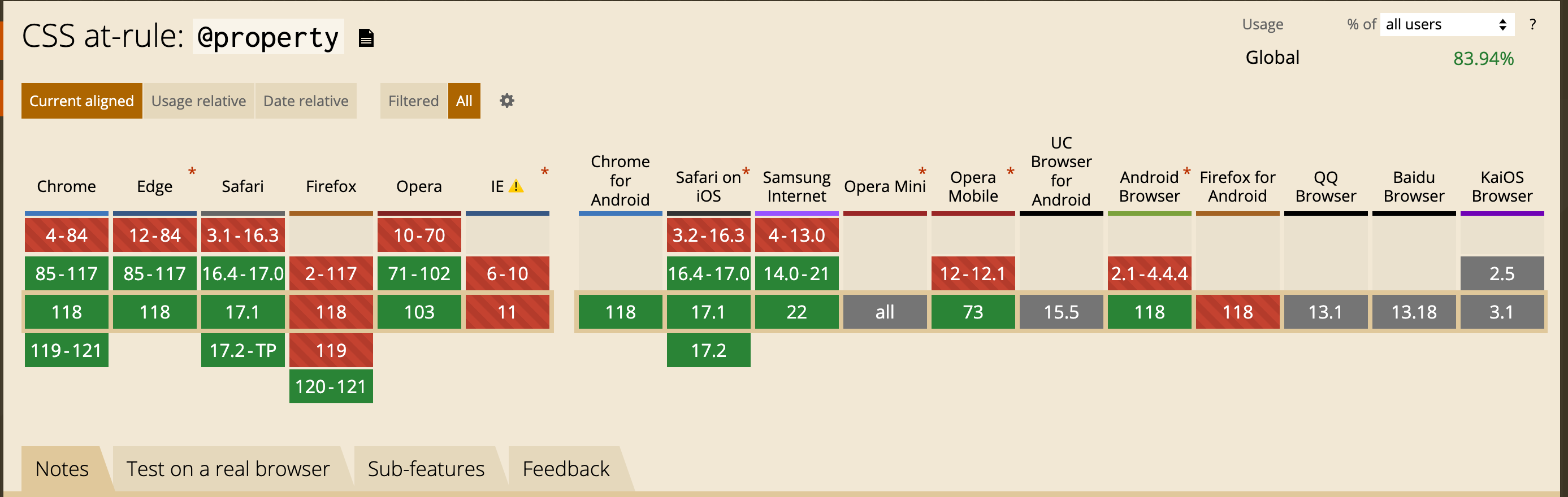
兼容性
效果预览
相关代码
- 点击这里查看